The anniversary passed without my notice, but I realized I’ve been running my little hobby project to track US newspaper stories for over a year! By far my longest running project not tied to a paycheck, I think I’ve written 12 posts on on the project over that time:
- Mining the News: Data Gathering
- Newspaper Story Similarity
- Just how big is the Trump-Ukraine Impeachment story?
- Trump-Ukraine Impeachment Story: update after a few weeks
- Trump-Ukraine Impeachment story: 1 month in
- The Trump-Ukraine Impeachment Story: Just keeps going!
- President Trump Impeached
- Newspaper Trends in Early 2020
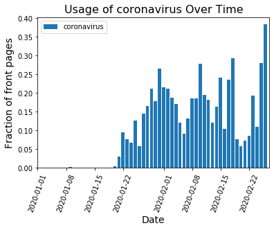
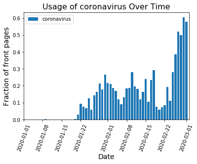
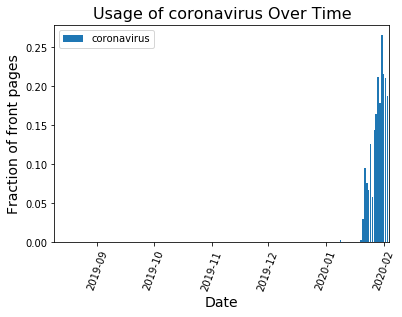
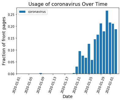
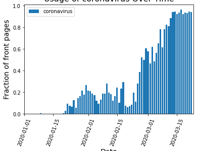
- Coronavirus in the News
- The Dominating Growth of Coronavirus in the News
- The only story in town: COVID-19
- COVID-19 Check in
And that’s with my life getting dominated by COVID-19 response work since April! This will be post 13, and is going to serve as sort of summary of the work I have done over the past year. Data is from 08.09.2019 to 08.31.2020.
As with most pipelines, the bulk of the code writing happened at the start. All the scripts to grab newspaper front page PDFs from the Newseum’s website, identify headlines and group the text into stories (see example below) had to happen before I could start comparing stories from different newspapers!
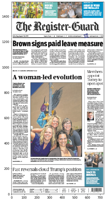

Above: Before/After visualization showing how I identify the different possible headlines in the front page PDF and then associate the story text with the headline.
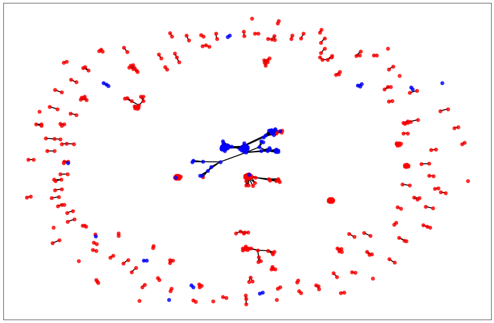
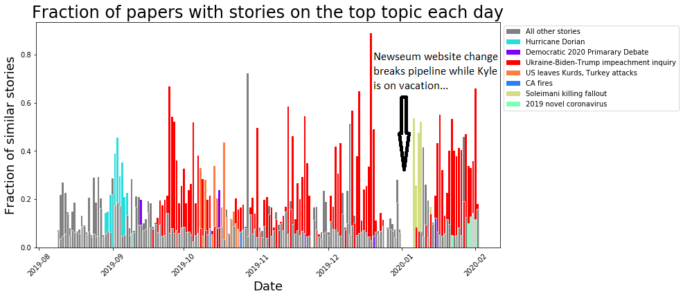
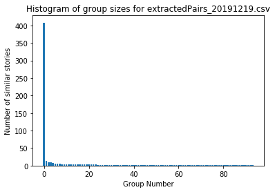
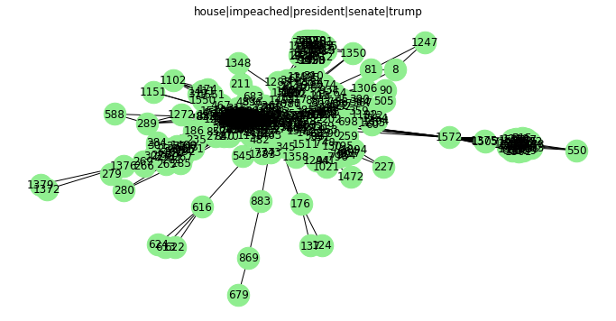
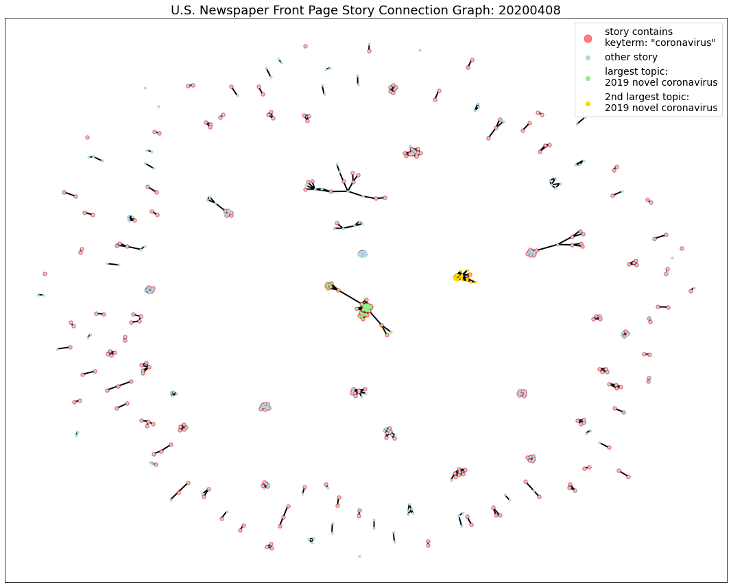
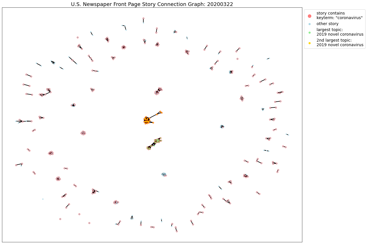
After that, I needed some method of identifying if stories were on the same topic. Some natural language processing and graph work did the trick, generating these graphs each day’s stories, which clustered stories on similar topics:


Above: Example graphs of stories from several days. Each green dot (node) represents a single story and each black or red line (edge) links 2 stories on the same topic. Some days, there seemed like there was only a single story in town. Other days, nothing really seemed to be dominating the news. Normally 1-2 topics were the clear front runners.
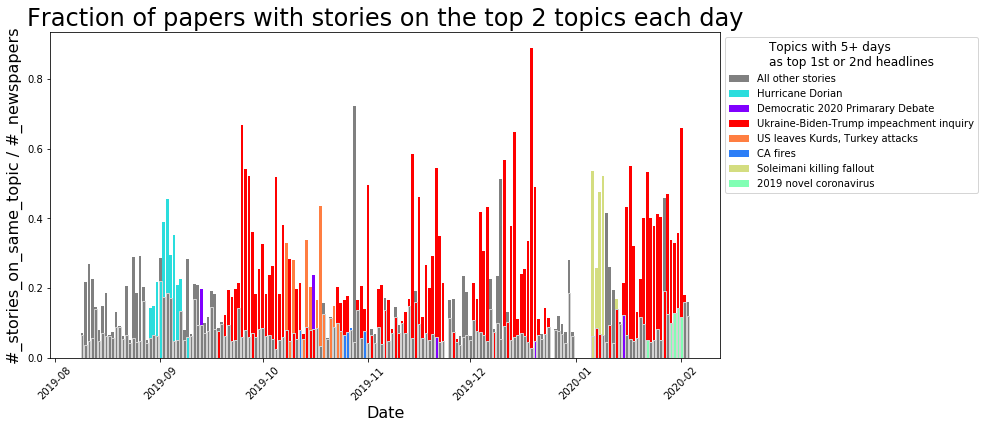
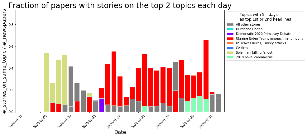
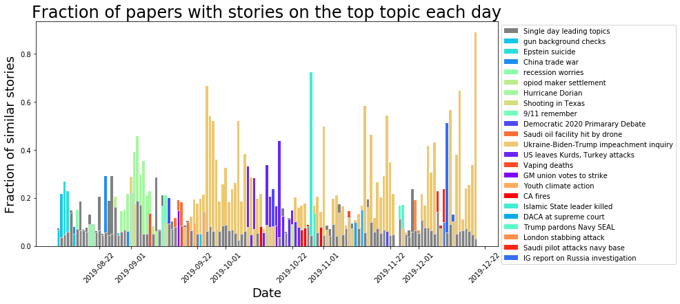
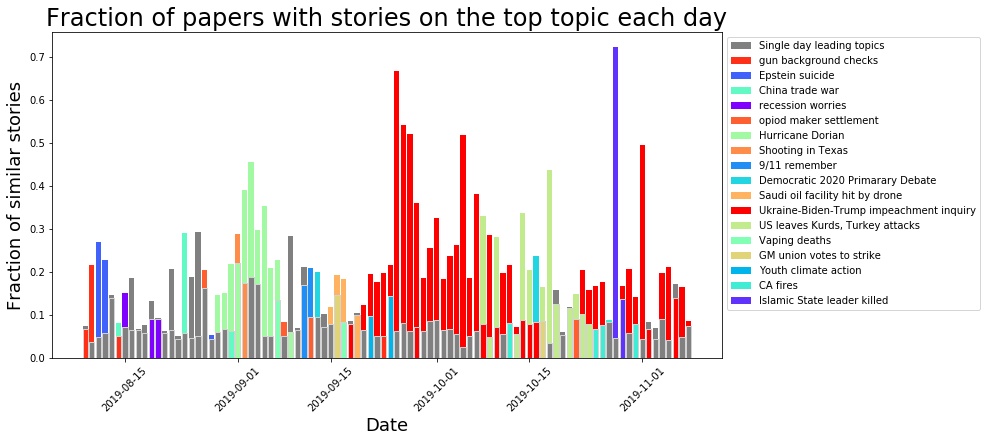
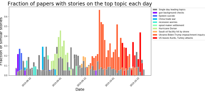
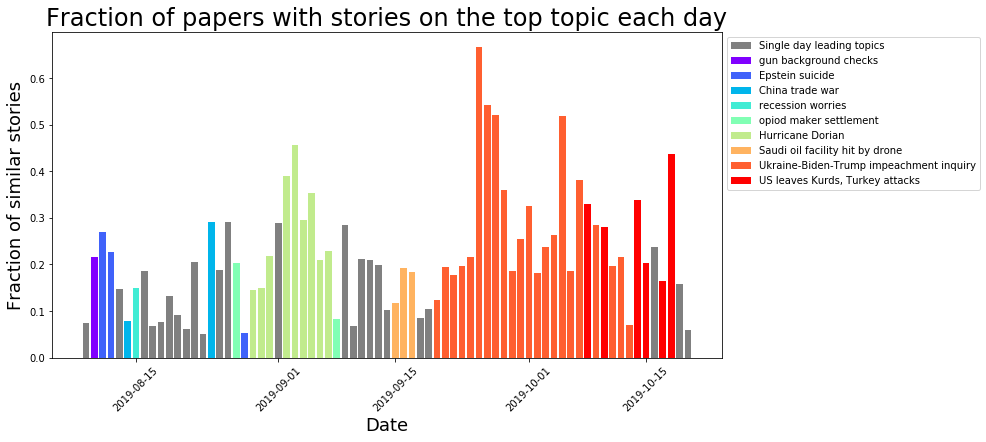
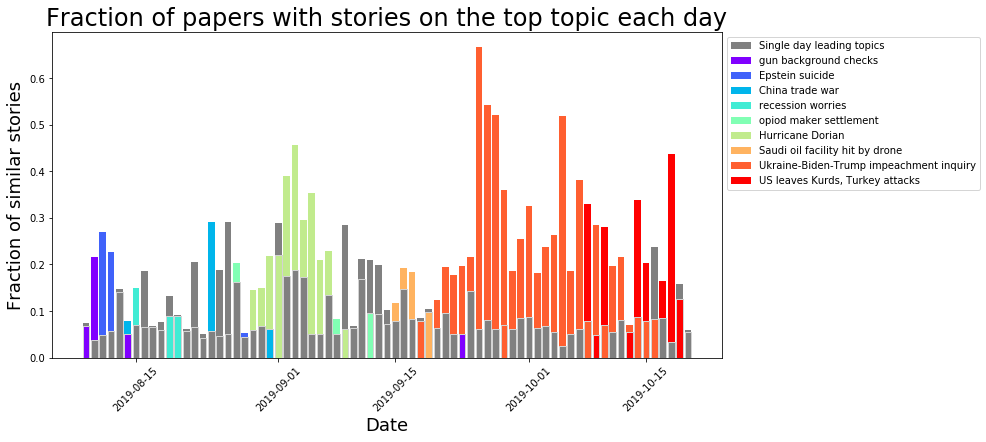
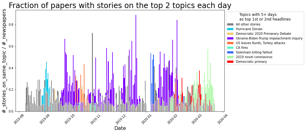
At this point, I turned my focus to the largest clusters and started identifying which topic was such a big deal that so many different stories were being written on it that day. There was a bit of manual effort in this step, although the computer did most of the work. Over a year later, a lot of news has come and gone…

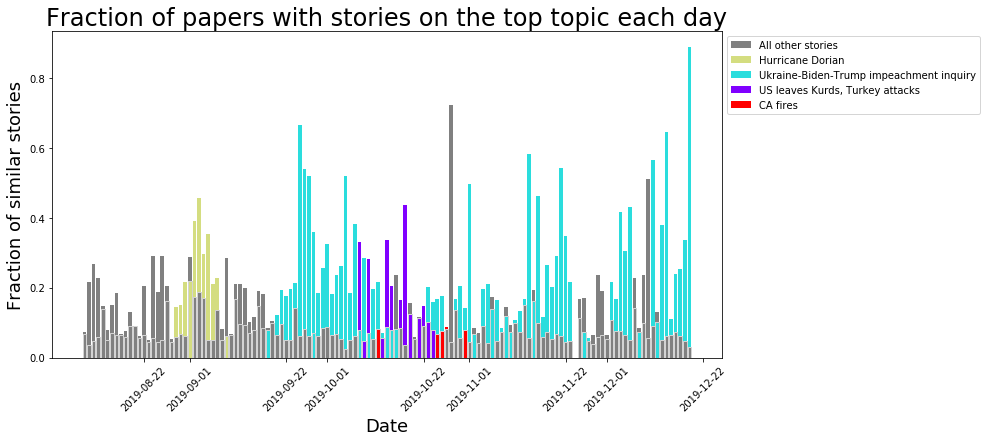
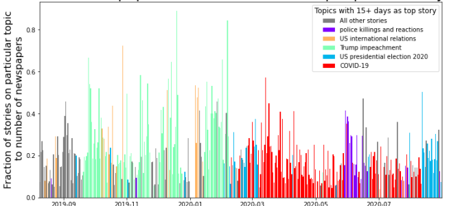
But now that I have a year’s worth of data, I can retrospectively go back and see which of those topics can be grouped together. For example, stories about the Democratic primary contenders, Biden’s pick of Harris as a VP candidate, and the USPS delivery issues can all be lumped together into stories about the US 2020 presidential election. This reduces the number of topics from 148 to 22, although did add another layer of subjectiveness to my work.
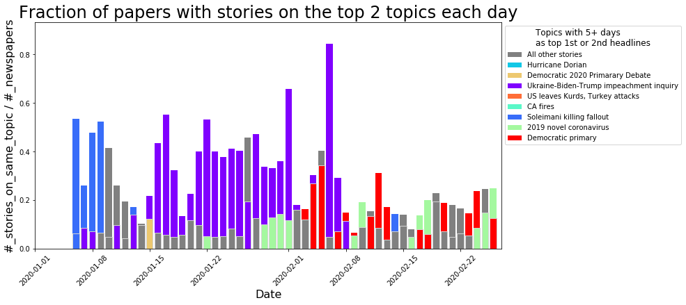
Looking at the distribution of these 22 topics, something that immediately jumps out is how just a few topics really dominated the year’s news.

Leading the way are stories on COVID-19, followed by domestic presidential politics. First the impeachment of president Trump followed by the 2020 presidential election. Only 2 other topics were the leading story of the day for more than 15 days: US international relations (think ‘US abandoning the Kurds’, or the ‘trade war with China’) and police killings and reactions (think protests over Floyd’s killing).
Just looking at these top meta-topics is much easier than looking at the 148 original ones!

One thing that really jumps out is how clustered these stories are. Only 1 or 2 stories can really dominate the news for a period of time. Another thing to see is just how few other topics led the day’s news over the past year. Of the 376 days of data I collected, 289 of them had a top story which fell into 1 of these 5 groups.
So what to do with all this data? Honestly, I’m still not sure. I’ve done a lot of visualizations, but now I have enough data to start pushing into other realms. Maybe trying to predict how long a topic will keep it’s leading record? Training a bot to produce similar sounding stories? But I think it’s time to stop fiddling with the pipeline and start figuring out new things to do with the data, or time to find a new project! Maybe go back to some of that agent based modeling…
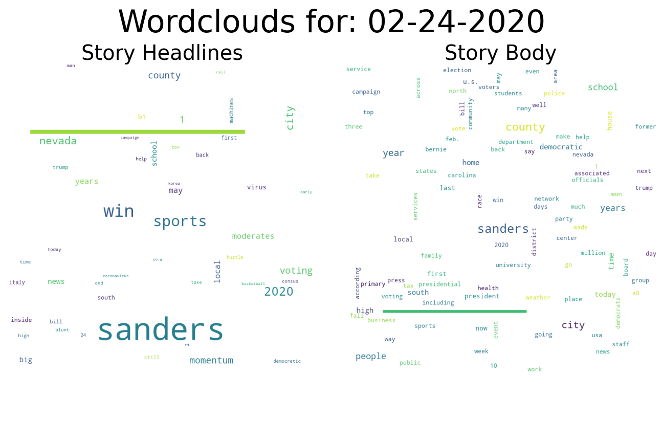


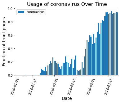


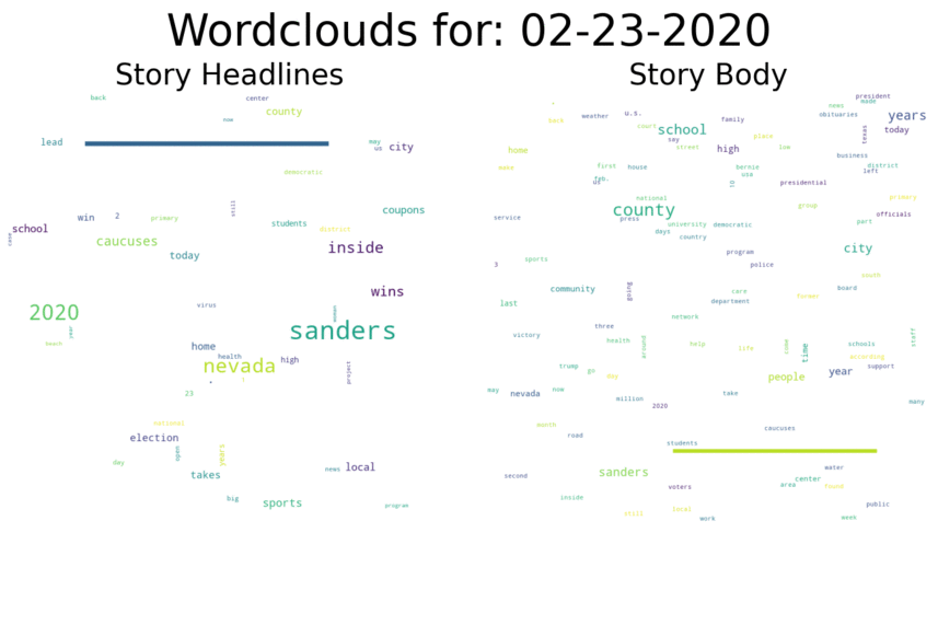
 When there isn’t a strong national story dominating the headlines, word choice is spread out over many topics and no word frequencies get particularly large. That’s what we see on days like Feb. 23:
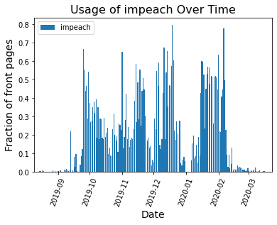
 Comparison to the Trump Impeachment Trial:
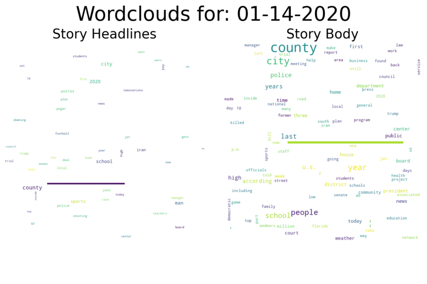 Again, we can see surges in the word cloud at various important points during the trial, with the largest surge occurring after Trump was acquitted:
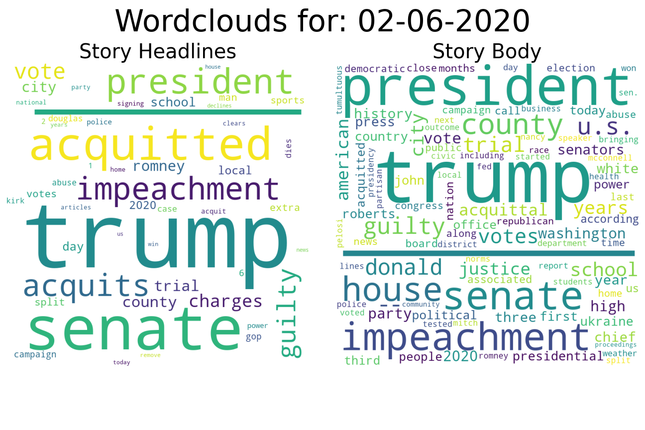 I’m also continuing all the