A 95% effective COVID-19 vaccine will be a game changer

When the game changes depends on how seriously we take the disease.

This week Moderna Inc. and Pfizer both announced their COVID-19 vaccines were 95% effective.Those are amazing numbers and could eventually end the global pandemic.

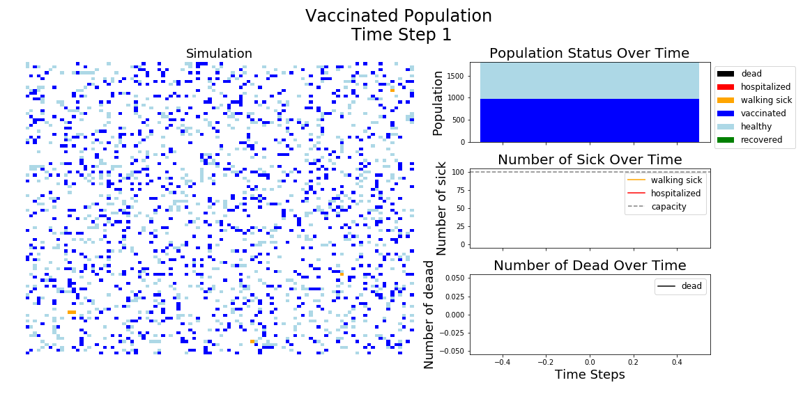
The most recent polling suggests 58% of Americans would consider getting the COVID-19 vaccine. Here’s an Agent Based Model (ABM) showing just how much of an impact a 95% effective vaccine would have on a population with 58% vaccinated.

So, a huge effect. Sadly, that won’t happen any time soon. Moderna thinks they will have 20 million doses of vaccine available by the end of 2020. If that was distributed by lottery, that would mean only about 5% of each community would be vaccinated. Hopefully we will be more clever about the distribution, but it will still be many months until enough people are vaccinated to have a strong impact. In the mean time, it is vital to keep up the mask wearing and the social distancing! To see why, let’s look at the impact prevention measures like social distancing, mask wearing, and vaccinations can have on the start of an outbreak.

First 100 time steps for 4 simulations highlighting how virus spread changes depending on parameters.

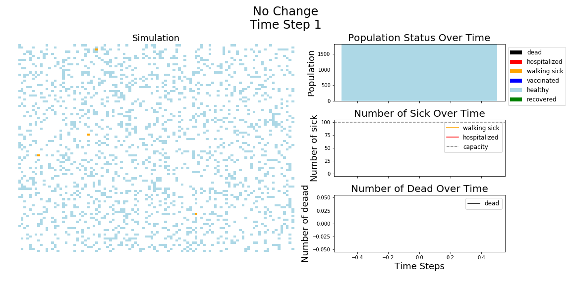
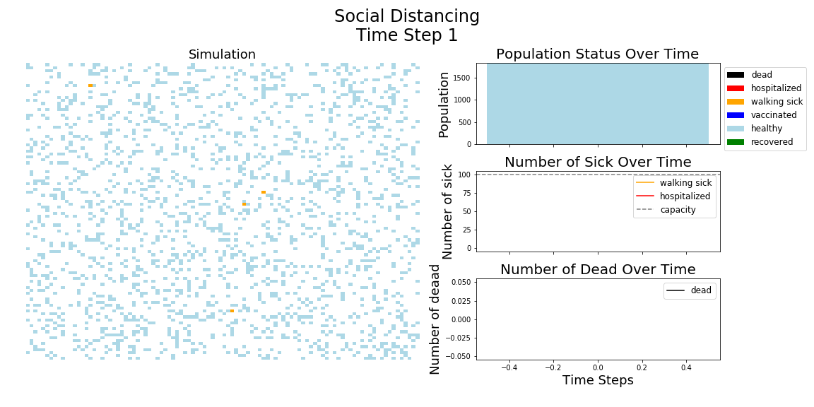
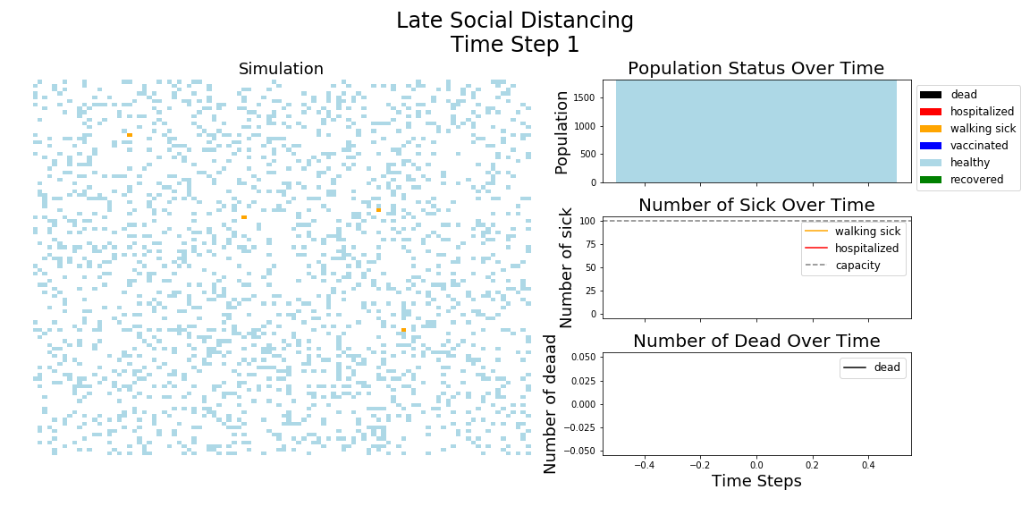
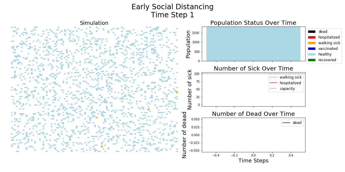
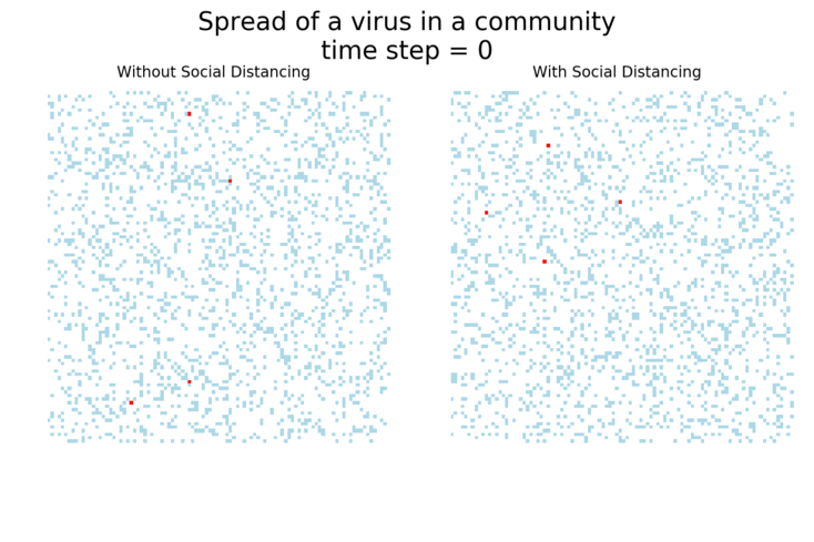
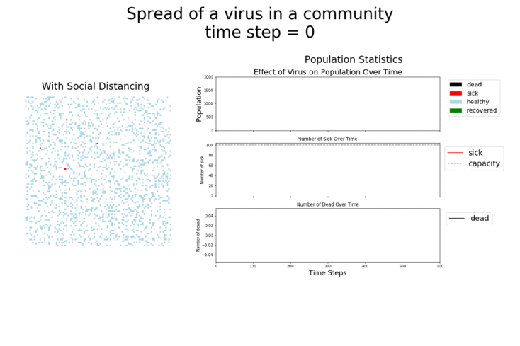
In each of the above simulations, 1,200 agents go about their little agent lives under different sets of conditions.

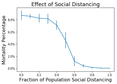
  • If the agents are taking COVID-19 seriously, a good chunk of them are wearing masks (50%) and the community is trying to do basic social distance (10% movement reduction).
  • If they agents aren’t taking COVID-19 seriously, no one is wearing masks and movement is unrestricted.
  • With the vaccine, I’m assuming 20% are vaccinated, nearly quadruple what Moderna thinks they can supply by the end of 2020. It’s enough to see an effect, but also a more realistic short term expectation, versus the 58% of Americans who say they would take the vaccine.

The main takeaway should be pretty clear: disease spreads fast when people don’t take it seriously. The vaccine can help slow that spread, but only a combination of vaccines and other actions can really stop the disease.

In the above gif, I’m only showing the first 100 time steps. That’s far fewer than shown in the first few images of this post. That’s to avoid getting to saturation issues in this work. I’m simulating only 1,200 agents, and the community can pretty quickly saturate on disease spread. Only about 12 million cases of COVID-19 have been reported in the United States, which is about 3.6% of the country’s population. We are far from seeing herd immunity effects in real life, and I wanted to avoid showing them in these visuals.

I’ve used ABMs to model the spread of COVID-19 in communities before, focusing on how key social distancing and movement reduction were to flattening the curve and slowing the spread of the disease. It’s worth saying again that these are simplified models. They help give us insight into the real world, but don’t take they numbers they generate as absolute truth!

Here are some sand plots of those same simulations from above. They drive home how many Agents get sick with the disease in each scenario. As you can see, the combination of vaccines and taking the disease seriously makes the biggest impact.

It should be very clear that growth rates are highest when masks are not being used and social distancing has gone out the window. If those are used, the vaccine does provide a bit of help, but it’s not as big of an impact as the other measures.

It may surprise you, but you don’t actually need a vaccine to drive COVID-19 out of a community. With high enough mask wearing or social distancing, the curve can be kept flat indefinitely:

We saw that in the spring, when people were really staying home. Measures of mobility across the country showed a huge drop in travel and the number of new cases of COVID-19 in the country dropped. However, the costs of social distancing proved to be too much for us, and by the summer mobility had really picked back up.

From https://covid19.apple.com/mobility, this shows drop off in mobility across the United States in the late spring. It also shows the return to baseline for walking and driving that happened over the summer.
From https://coronavirus.jhu.edu/data/new-cases, a plot of new COVID-19 cases. Data highlights how strong movement reductions in April and May helped flattened the curve. Note: testing capacity increased throughout 2020, so expect a far larger fraction of actual cases to have been missed early in the year.

The appetite for long term mobility reduction seems to have gone away, although some place that were hit hard early are still being more cautious than before the pandemic set in.

Mask wearing can also really help. Studies have found masks are up to 67% effective at preventing COVID-19 transmission for each interaction. With enough people wearing masks, you actually don’t need very much social distancing (in these ABM models) to really reduce the spread of the disease.

Fractions of an ABM community that get sick with the disease. With no movement reduction and no mask wearing 95% of the community gets sick. But if 80% of the community wears masks, even with no movement reduction, only 12% of the community falls ill.

Look at that. If we had just moderate social distancing and good mask wearing, we would hardly even need a vaccine. Unfortunately, mask wearing started to increase from the 20% range to the 50% range in the summer, right when social distancing efforts were winding down.

And unfortunately, the United States seems stuck at around 50% mask wearing for some reason. Some don’t want to wear it for political reasons. Others don’t want to be a bit uncomfortable. Still others like to have their noses in the open air. For whatever reason, we can’t count on enough people wearing masks to stop the spread of COVID-19.

The hope now is that we can get just enough of the county vaccinated while also maintaining just enough social distancing and have enough people continue to wear their masks to actually stop the disease. But a big worry of mine is that we will hear about a vaccine in our area and stop doing the other things. Stopping the mask wearing and social distancing before enough people are vaccinated is a recipe for one final, tragic COVID-19 surge. One that could be entirely prevented with maintained vigilance.

So do your part! Keep wearing masks and keep socially distancing as much as you can. We may finally have a light at the end of the tunnel, but a whole world of hurt could happen before we get there. It’s up to all of us to stop as much of that pain as possible.

Code for this work can be found on GitHub.

As always, this blog represents my personal views and is not affiliated with any government or organization.

Over a year of graphing the news

The anniversary passed without my notice, but I realized I’ve been running my little hobby project to track US newspaper stories for over a year! By far my longest running project not tied to a paycheck, I think I’ve written 12 posts on on the project over that time:

And that’s with my life getting dominated by COVID-19 response work since April! This will be post 13, and is going to serve as sort of summary of the work I have done over the past year. Data is from 08.09.2019 to 08.31.2020.

As with most pipelines, the bulk of the code writing happened at the start. All the scripts to grab newspaper front page PDFs from the Newseum’s website, identify headlines and group the text into stories (see example below) had to happen before I could start comparing stories from different newspapers!

Above: Before/After visualization showing how I identify the different possible headlines in the front page PDF and then associate the story text with the headline.

After that, I needed some method of identifying if stories were on the same topic. Some natural language processing and graph work did the trick, generating these graphs each day’s stories, which clustered stories on similar topics:

Above: Example graphs of stories from several days. Each green dot (node) represents a single story and each black or red line (edge) links 2 stories on the same topic. Some days, there seemed like there was only a single story in town. Other days, nothing really seemed to be dominating the news. Normally 1-2 topics were the clear front runners.

At this point, I turned my focus to the largest clusters and started identifying which topic was such a big deal that so many different stories were being written on it that day. There was a bit of manual effort in this step, although the computer did most of the work. Over a year later, a lot of news has come and gone…

The top story for each day over the past year+. Far too many to visualize!

But now that I have a year’s worth of data, I can retrospectively go back and see which of those topics can be grouped together. For example, stories about the Democratic primary contenders, Biden’s pick of Harris as a VP candidate, and the USPS delivery issues can all be lumped together into stories about the US 2020 presidential election. This reduces the number of topics from 148 to 22, although did add another layer of subjectiveness to my work.

Looking at the distribution of these 22 topics, something that immediately jumps out is how just a few topics really dominated the year’s news.

Leading the way are stories on COVID-19, followed by domestic presidential politics. First the impeachment of president Trump followed by the 2020 presidential election. Only 2 other topics were the leading story of the day for more than 15 days: US international relations (think ‘US abandoning the Kurds’, or the ‘trade war with China’) and police killings and reactions (think protests over Floyd’s killing).

Just looking at these top meta-topics is much easier than looking at the 148 original ones!

Fraction of stories on the top topic to number of newspapers studied. Roughly speaking, if the fraction is 0.8 than you’d expect about 80% of the newspapers to have a story on the topic for a given day. Only showing topics with 20+ days as the topic daily topic

One thing that really jumps out is how clustered these stories are. Only 1 or 2 stories can really dominate the news for a period of time. Another thing to see is just how few other topics led the day’s news over the past year. Of the 376 days of data I collected, 289 of them had a top story which fell into 1 of these 5 groups.

So what to do with all this data? Honestly, I’m still not sure. I’ve done a lot of visualizations, but now I have enough data to start pushing into other realms. Maybe trying to predict how long a topic will keep it’s leading record? Training a bot to produce similar sounding stories? But I think it’s time to stop fiddling with the pipeline and start figuring out new things to do with the data, or time to find a new project! Maybe go back to some of that agent based modeling

Managing a Pandemic with Social Distancing

Social distancing is currently our best tool for keeping the COVID-19 outbreak from killing hundreds of thousands to millions of people across the globe. By staying at home and drastically reducing interactions, we all help flatten the infection curve and minimize the number of days our hospitals don’t have space for new sick individuals in need of medical care.

But social distancing is not a precise tool. And while it is keeping a lot of people from getting sick and possibly dying, it’s also wreaking livelihoods, stagnating economies, and reordering daily life for huge swaths of the population. So, what’s the best strategy for balancing the use of social distancing while getting back towards normal life?

No social distancing

The question you really have to answer is, what are you trying to achieve? If you want to minimize impact to normal life, maybe you don’t want to do any social distancing. I’ve posted similar visuals before, but below is a simulation of what not doing any social distancing looks like. There’s a lot of information in this simulation, but watch how the number of dead agents in the bottom right shoots up as the hospitals get over capacity.

combinedNoChange_200325
Simulation of rapid disease spread when no social distancing actions are taken. The left panel shows the 2,000 agents moving about their environment. The right panels shows statistics on the population, including number of sick, hospitalized, and dead.

These simulations are done with Agent Based Modeling (ABM). 2,000 agents that can be healthy, sick, hospitalized, recovered, or dead move around a 100×100 grid environment. If a susceptible agent moves into the same square as a sick agent, the susceptible one gets infected. Sick agents have a chance of becoming hospitalized during their illness, and also have a chance of dying. If the hospitals are over capacity, defined here as 5% of the population, the mortality rate jumps from 2% to 10%.

In the scenario of no social distancing, disease rapidly spreads through the whole population. The hospitals reach capacity and stay over capacity for an extended period of time, causing the death rate to dramatically jump as people who need care can’t get it. But, it is all over relatively quickly. By time step 300, the agents in the population have either died or recovered.

Blanket social distancing

Assuming you don’t want loads of people dying, social distancing is the tool we currently have. Below is what life looks like in the same community with the same disease, but now where everyone has reduced their movement by 50%.

combinedSocialDistance_200325

Far fewer agents are getting sick and dying. The hospitals are never overtaxed, and so the number of dead never skyrockets due to lack of medical support. And much of the population never gets ill.

But the disease hangs around a lot longer. Even by the end of time step 600, there are still a few infected agents. Meanwhile all those side effects of social distancing keep compounding.

In the early days before we know how widespread COVID-19 had become, America was in the first scenario. But now we’re in the second phase, where as many people as possible are trying to social distance. What happens next will determine how many more people die and how quickly life gets back to normal.

Late reaction social distancing

One option is to only apply social distancing in dire circumstances. Say, whenever the hospitals are nearing capacity. This leads to cycles of outbreaks that repeatedly overtax the health care system and cause both the virus to hang around longer and a surge of deaths each time the hospitals run out of capacity:

HospitalThresh_200411

This is not a good choice. That’s because by the time the hospitals are at capacity, there are even more sick agents that will need the hospitals in the coming time steps. The social distancing starts too late for those agents, and deaths grow to almost the same amount as if there had been no social distancing.

Early reaction social distancing

A better choice would be to start social distancing early enough to forestall the hospitals becoming overwhelmed. Below is the same world, but now everyone starts reducing their movement once the number of sick gets close to the capacity threshold:

EarlySD_200410

This model isn’t wonderfully realistic, but it gets at the idea that early identification and periodic social distancing policies can keep a disease outbreak in check and the hospital systems from being overwhelmed. The disease hangs around much longer than if population movement was less restricted, but periods of normality are sprinkled throughout the time period.

Vaccinated and free

Of course, the best choice is to have a vaccine. With enough of the population vaccinated, society can move about as normal and the disease can be kept from overwhelming the community.

Vaccine_200413

In this simulation, 50% of the population starts off vaccinated and the vaccine has an 85% efficiency. So while vaccinated agents can still get sick, they are far less likely to do so. Notice how similar the curves for number of sick and number of dead appear to the simulation with blanket social distancing. But with the vaccine protecting the population, no social distancing had to take place and none of the harsh side effects of social distancing needed to be accepted.

Moral of story: A vaccine is best! But until we have one, applications of social distancing early enough to stave off large outbreaks is next best thing.

Source Code

Code for this project was originally done in Jupyter notebooks. I’ve been translating that into python script files for easier sharing and running. That’s still a WIP, but you can find most of the pieces here.


COVID-19 Check in

I’m fortunate enough to have a job directly contributing to the effort against COVID-19 in the United States. That has meant long workdays,  vanished weekends, and no time for the personal hobby projects that go into this blog. Today was a day off though! So here’s a quick dump of all the COVID-19 related analyses I have running in the background.

Coronavirus in the headlines

Coronavirus started showing up on U.S. newspaper front pages in late January, and it has since taken over as the new reality. (Not surprising with how much the pandemic is changing lives, but still impressive to see!)

I’ve visualized this before, but here are some updated  word clouds made from all my gathered front pages since late February. Watch how coronavirus literally grows to dominate the clouds, and never releases that dominance:

WC_COVID19_200409
Growth of coronavirus and related terms in the headlines and text of stories from U.S. newspaper front pages. The long bar is my hacky way of forcing the wordclouds to reflect relative word frequency between days.

This dominance shows up no matter how many different ways you slice the data. Here are some visuals of the fraction of papers that mention the word “coronavirus” somewhere on their front pages:

By mid March, almost every paper had a story mentioning that single word at least once. I don’t think that’s ever happened in my analysis before. Even President Trump and his impeachment didn’t get close to that dominance:

A new COVID-19 reality

Despite coronavirus showing up in every paper every day, my previous measures of topic dominance don’t really capture this. My previous work used the similar language between stories to automatically detect when stories were on the same topic. It worked great for showing how important the impeachment inquiry and trial were in the American narrative. But for coronavirus, I never see a huge break through story dominating in the same way:

multiDayFractionRed200409
The top 2 main topics of U.S. newspaper front pages for 2020. Stories that share similar language are grouped into topics. The top 2 topics with the largest number of stories are manually assigned a label (e.g. “Democratic primary”) that links topics between days. The 2nd largest topic is plotted in front of the largest topic.

So what’s happening? The impeachment was a very localized topic. Each day, all the papers were publishing stories hashing the latest event to have come out of Washington DC. The language of all those stories was very similar, so my little algorithm had no trouble linking them together.

COVID-19 is different. It’s impacting everything everywhere. And because of that, it’s really become a new reality that impeachment never achieved. There are COVID-19 stories about the economy, politics, hospitals, New York City, Washington State, social distancing, … The list never ends. And my little algorithm is seeing each of those as their own topic, rather than the single meta topic of coronavirus. That shows up in the above bar chart. For the past month, nearly every one of the top topics has been about something coronavirus related.

We can see this by looking at one of the graphs the algorithm generates of stories linked into topics and layering on top of that an indication if the word “coronavirus” was in the story:

graph200409Coronavirus
A graph of the many Topics found in front pages from 04/08/2020. Every story (blue dot) that was linked to at least 1 other story (black line) shown. Stories that are part of the top 2 largest topics shown as green and yellow. Any story that mentioned “coronavirus” circled in red.

As you can see, the word “coronavirus” shows up in a huge number of the stories. But there are several separate topics being identified. However, a closer inspection shows they are all about how coronavirus is effecting our lives:

  • The largest topic is on NYC’s death toll.
  • The next is about Trump firing an oversight watchdog
  • The 3rd largest is on churches finding ways to meet virtually
  • The 4th is about a nursing home
  • The 5th covers the acting Secretary of the Navy resigning

All those stories have to do with the new COVID-19 reality.

This may have not been my best blog post ever, but time is very limited and I wanted to get out what I could!


Stay safe out there all.

The only story in town: COVID-19

The exponential spread and unprecedented actions to combat COVID-19 have made the virus the only major story in town. Over the last few weeks, the virus has been dominating the headlines in ways not even the Trump impeachment trial could achieve.

Below is a GIF of word clouds generated from the front pages of U.S. newspapers over the past few months. The time span covers Trump’s acquittal, the death of Kobe Bryant, and Biden’s dominance of the Democratic primary. But for the last few weeks, the only story has been coronavirus.

wordclouds_200322
Wordclouds from words in the headlines and story bodies from U.S. newspaper front pages over the past few months. The size of a word roughly correlates to the frequency of that word that day.

A simple key term examination shows that pretty much every paper in recent days has had a story about COVID-19 somewhere on its front page:

KeytermCoronavirusZoom20200322

That is incredible. Even at the height of the impeachment trial, the same key term was never found on such a large fraction of the papers:

KeytermImpeach20200322

I’ve been tracking this using some text similarity and graphing techniques for over 6 months now. I compare the text from each extracted story to the text in every other story and identify when the stories shared similar language. The result is a graph where each node (green dot) represents a story extracted from a paper and each edge (connecting line) represents the language between the 2 stories being found to be very similar. An example of this graph is shown below from March 14th, the day after President Trump declared an national emergency over COVID-19:

graph200214

(Not shown are stories that didn’t share any connection to any other story.)

On March 14th, the story about Trump declaring the emergency dominated the headlines. It’s that large cluster in the center of the figure. On days when a single story isn’t so dominate, often a second substantial cluster also appears. But from my past work, it’s pretty rare to have more than 2 substantial clusters on a given day.

So for the past 6 months I’ve been tracking the topics of these top 2 clusters. Each day I manually review them and identify what topic they are about. Often, a story will dominate the headlines 1 day and vanish the next. Think Kobe Bryant’s crash–a huge story one day and gone from the front pages the next. Other topics have staying power, like the impeachment trial or the presidential primary. COVID-19 is looking definitely like one of those staying stories:

multiDayFractionRed200322
Fraction of newspapers with a story on a given topic. Plotted are histograms for both the first and second largest topic clusters found each day, with second plotted in front of the first.

One important thing to point out: despite dominating the headlines, COVID-19 has smaller histogram numbers int he above graph than, say, the impeachment trial. I have done some preliminary work on this, and it seems to be because the COVID-19 stories change geographically. For the impeachment trial, all the stories were about events in DC. So stories all were very similar to one another. But for COVID-19, stories tend to be more local. So my algorithms often miss identifying these as being part of the same topic. (If you have good eyes, you can see that the last few days both the 1st and 2nd topics have been on COVID-19!).

I can visualize this failure of my current algorithms by superimposing stories that contain a particular key term on a given graph.

Here’s such a visual from today’s graph.

graph200322Coronavirus

Each story about COVID-19 is ringed in red. Notice how most of the stories in the larger clusters have this ring? The top cluster is stories about New York and hospital supplies. The next largest cluster in on the government’s economic rescue plan. The 3rd cluster is about charities closing down because of the virus. Different topics, but all tied together by a meta topic of the coronavirus.

So long story short: COVID-19 is a huge story right now and my algorithms weren’t built to handle this kind of thing. But what they show is what you’d expect: the story is everywhere and probably won’t be going anywhere anytime soon.

Flattening the Curve

With COVID-19 spreading across the country, the coronavirus and how to fight against the disease are pretty much the only thing topic in the news. For visual reference, here’s a word cloud made from U.S. newspaper front pages from Monday, the day after the 2 man Democrat Presidential Debate:

20200316

Normally a presidential debate would get top billing, but not last Monday. And I think all this attention on COVID-19 is a good thing, because it is helping change people’s behavior. Compared to the H1N1 influenza outbreak in 2009, COVID-19 is both more contagious and more deadly.  Because it’s a virus that only recently jumped from wild animals to humans, no one in the population is expected to have much resistance. And while vaccine development is underway, it may take over a year before such a tool is ready to go.

Agent Based Model of Social Distancing

That leaves us with a limited toolbox for dealing with the epidemic. The big push recently has been voluntary and required social distancing. There have been a lot of stories on this lately (including this great one from the Washington Post, from which I’m riffing for this blog), and the main goal is to slow down the spread of the disease by limiting human interaction (and transmission!) enough so that the medical system doesn’t get overloaded.

I’ve thrown together an Agent Based Model (ABM) to demonstrate this.

comparisonThe model has the following features:

  • Each of the 2000 agents can be healthy, sick, recovered, or dead
  • Each time step, an agent can more left, right, up, down, or stay put on a 100×100 grid
  • If social distancing is being performed, some percentage of the population does not move. In the above GIF, it’s 60%
  • An agent become sick if it moves to the same spot as an already sick agent.
  • A sick agent is sick for 35 time steps, after which it either recovers or dies.
  • If more than 5% of the population is sick, the mortality rate jumps from 2% to 10% to simulate the medical system being over capacity

As you can visually see, the disease spreads faster and kills more agents in the left hand animation without social distancing. Conversely, the disease stays in the population longer with social distancing. But mortality rates are lower.

Including Some Statistics

Below are the same ABM simulations with and without social distancing, but now with some tracked statistics also being shown. At each time step, I count how many agents are in each state and visualize the distribution. We can see the rapid growth in illness, the strong uptick in deaths when the capacity threshold is breached, and then the drop in new cases once most of the population has been exposed.

withoutSD

Flattening the Curve

Focusing on the red curve for the number of sick, we see the large peak that is what everyone is so worried about when it comes to COVID-19 (e.g. “flatten the curve”). By looking at the same collected statistics during the ABM simulation with social distancing, we can see that flattening behavior.

withSD

As we’ve already seen, the disease takes longer to spread through the population. So there are fewer sick agents while the system is over capacity and far fewer deaths. Even more importantly, not everyone in the population ends up being exposed to the disease. In the real world, we want to have hospital beds ready is someone needs one because of COVID-19. And social distancing helps make that more likely. But even better is to never have that person catch the disease. And COVID-19 helps with that too!

Future Work

This was work I threw together in spare hours outside of teleworking over the past few days. In future posts, I plan to investigate:

  • how this compares to vaccines,
  • where the inflection point is for social distancing to be effective,

(Update 3/20/2020: Preliminary work on this is done:)

EffectSocialDistancingOnMortality_2000by100x100_sick35

  • how the results and statistics change if social distancing starts mid way into the outbreak, and
  • giving agents an age and having their actions and outcomes attached to that variable.

Do you have other ideas? Let me know!

The Dominating Growth of Coronavirus in the News

Over the past week, we really seem to have really hit an inflection point for how much ink newspaper front pages are giving to the coronavirus epidemic. Just check out this GIF of word clouds from over the past few weeks (selected stills below) to see how headlines have become dominated by COVID-19:covid19

(A similar visual from President Trump’s impeachment trial is down below.)

I’ve been collecting pdfs of newspaper front pages for over 6 months. For each day, I’ve developed algorithms to identify the headlines on the paper, the corresponding news stories, and extract the text. From that point, I can take all the text and count up how many times individual words appear. If there is a single national story that many of the papers are reporting on, words associated with that story will show up a lot and be correspondingly large in the word cloud. For example, yesterday’s stories about coronavirus and the declared national emergency:

20200314
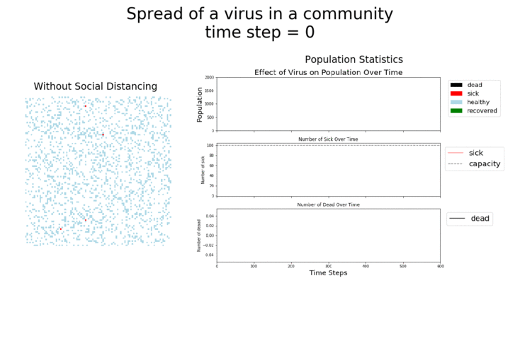
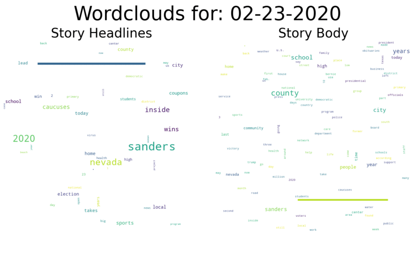
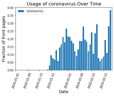
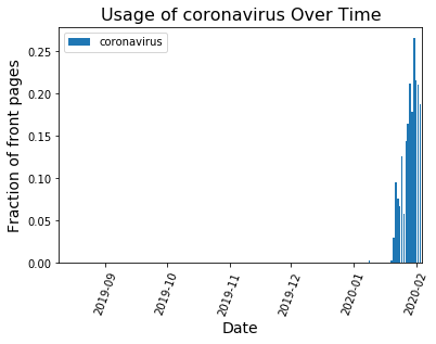
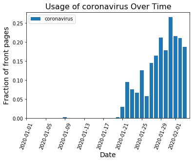
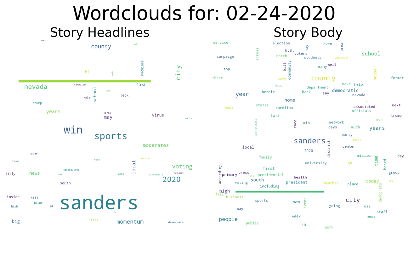
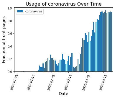
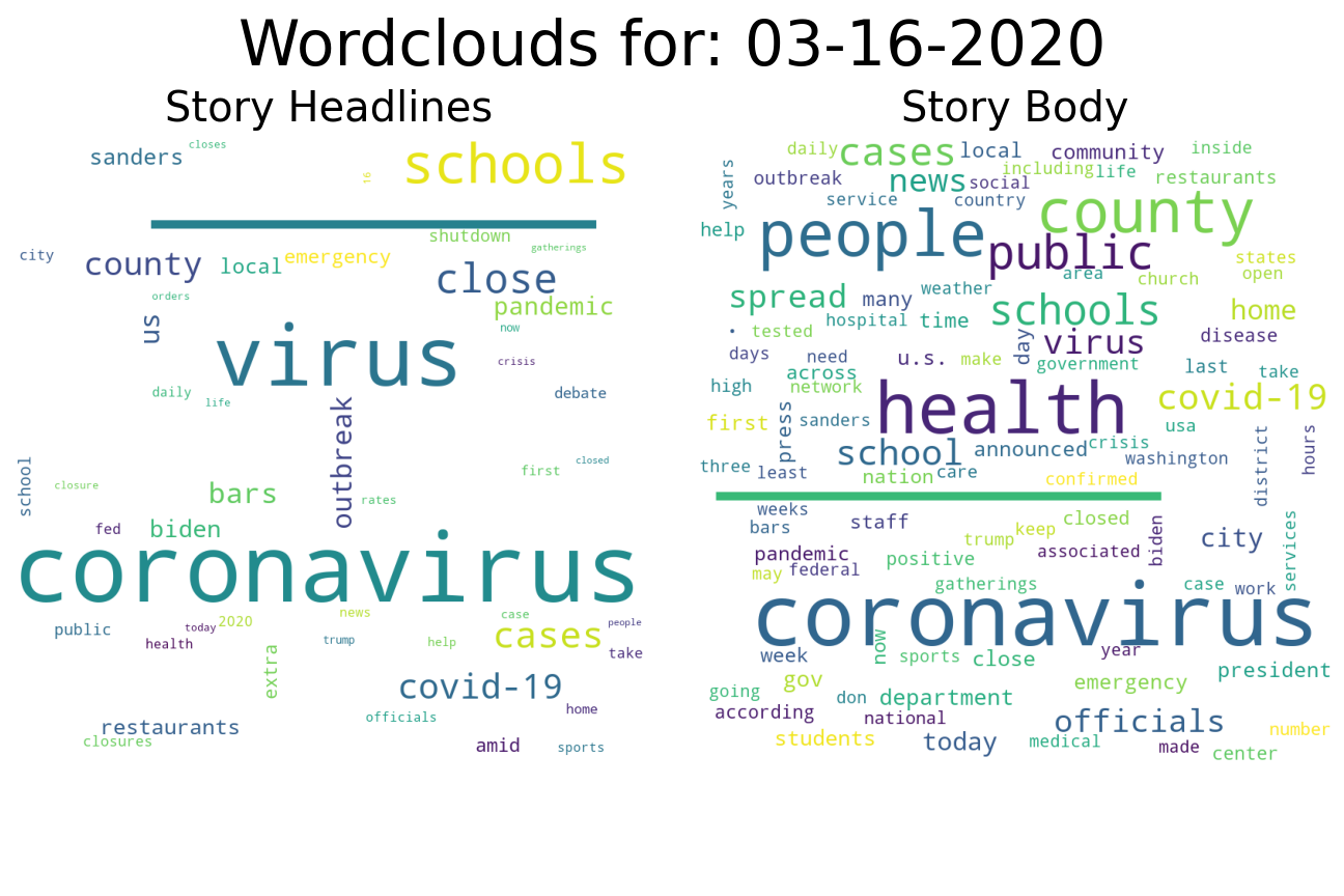
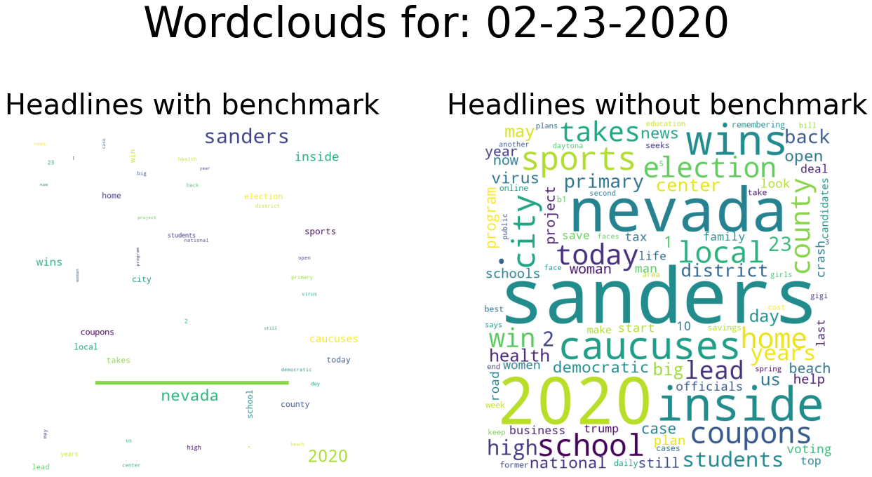
When there isn’t a strong national story dominating the headlines, word choice is spread out over many topics and no word frequencies get particularly large. That’s what we see on days like Feb. 23:

20200223

What I find especially impressive about coronavirus’ domination of the headlines is how strong it appears against other large new events. Just look how it compares to headlines after Weinstein was convicted or Super Tuesday:

This slideshow requires JavaScript.

A few Q&As for the curious:

Q: What’s with that long line (———-) that keeps showing up?

A: The package I’m using to generate the word clouds (aptly named “wordcloud”) scales the sizes of the words in the cloud based on the word with the highest frequency count. That’s a problem for me, because I want to visualize how word frequency changes day by day. So I insert a fake word (———-) with a constant frequency count as a benchmark. Here’s an example of what a word cloud for Feb. 23rd looks like without and with this benchmark word:

benchmark200223

By adding the benchmark, I can more easily show the dominance of a few words on days when a national story like coronavirus takes hold of the front pages.

Q: So, can I use that benchmark word (———-) to determine how frequency another word was used?

A: …Sort of. There are some complications. The scaling algorithm in word cloud takes into account the length of a word in a not always intuitive way. So the size of 300 mentions of ‘trump’ may look different than the size of 300 mentions of ‘coronavirus’. Also, the number of newspapers I’m pulling data from each day changes. Sundays especially are low paper count days. If I just did a raw count of word frequencies in the word clouds, it would look like every Sunday nothing was happening. So I scale the word counts by the number of papers in that day’s collection.

Q: Why generate 2 word clouds for headlines and body text each day?

A: Because I can! Occasionally the size of words in the body word cloud doesn’t match those in the headline one. I bet there is an interesting reason for that, but I haven’t gotten around to investigating it. But easy to generate the data now and go back to check later, yeah? For example, here are the word clouds after Kobe Bryant’s helicopter crash.

20200127
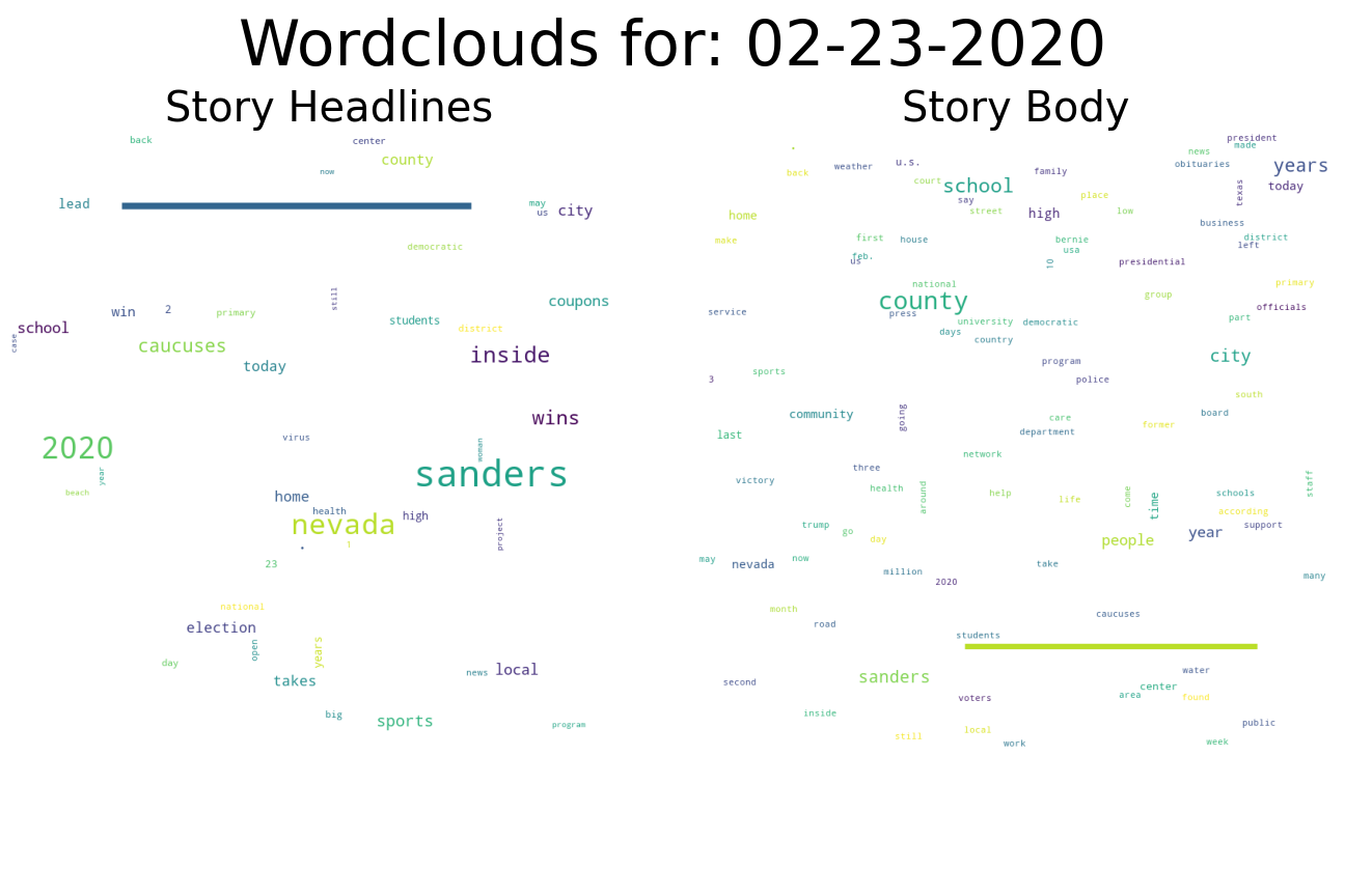
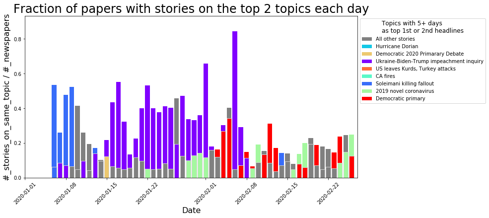
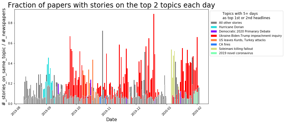
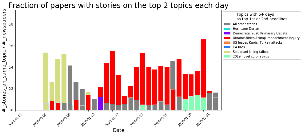
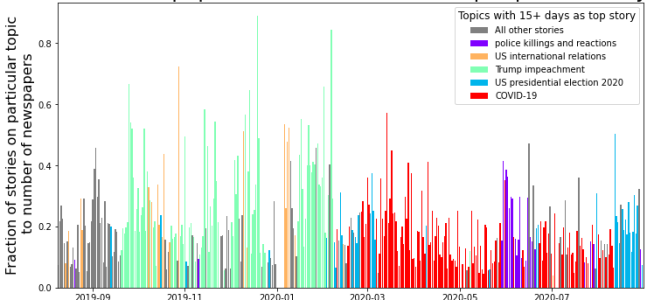
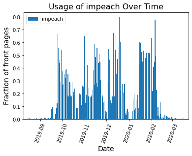
Comparison to the Trump Impeachment Trial:

I can do the same analysis on newspaper text from during President Trump’s impeachment trial. See below:

impeachAgain, we can see surges in the word cloud at various important points during the trial, with the largest surge occurring after Trump was acquitted:

20200206
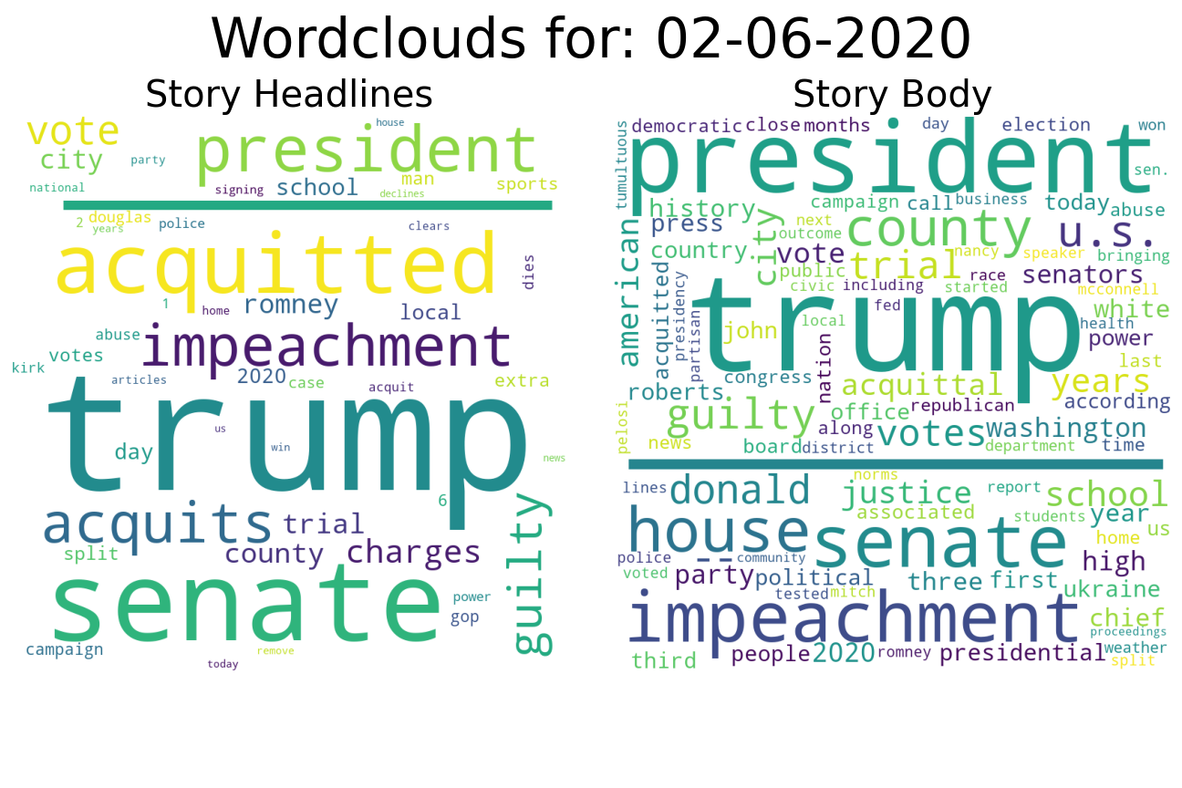
I’m also continuing all the graph analysis work and multi-day topic trend work I’ve written about previously. I’ll try to get a post on that work and coronavirus up soon!

Coronavirus (COVID-19) in the News

The coronavirus has been around since late 2019, and has been a continuous presence on the front page of U.S. newspapers since mid-January. But if you’re in the USA and feel like the intensity around the virus just went up a notch, you’re not alone.

Stories about the virus had their highest presence on U.S. newspaper front pages today (2/26/2019). Although no where near the levels of coverage that the impeachment trial of President Trump attained, stories about the virus have been flirting with being the top news story all month:

multiDayFractionRedZoom200226
Top 2 topics from US newspaper front pages for 2020. Topics that appeared in top 2 for 5+ days are given a color. Legend includes topics from 2019 (sorry! See my previous posts for those topics.).

Digging a bit beneath the surface, I can see that stories about COVID-19 never truly fell off the front pages, even if other topics became the top topic for the day.

KeytermCoronavirusZoom20200226
Fraction of stories that contained the word coronavirus somewhere in their body or headline. (Fraction values are slightly different than indicated in previous figure do to different methodologies, discussed below.)

So, how has the coverage of coronavirus changed over time? Well, one way to look at that is to check in on those top topics that were about the coronavirus and see what types of terms were being used in those stories.

Those top topics were found by taking all the hundreds of different stories that were on the front pages of different newspapers and forming a graph representation of how similar the language was in each story to every other story. (See my previous post for more info.) In the graph, each story is one of the nodes (little dots). If 2 stories shared a lot of language, an edge (line) was drawn to connect them.

graph200226
Graph of stories from 2/26/2020. Each story is represented by a green dot. Stories with similar language connected with a black edge. (An additional connecting routine links similar topics with red edges.)

What falls out of this is clumps of stories that are about similar topics. This process is not exact (hobby project!). Many stories don’t get connected (for reasons ranging from how the data was processed to how large the story was on the original front page). Below is the same graph, but with every story that mentions the word ‘coronavirus’ shown in blue while all other stories are in red. You can see a lot of stories in the center clump, but a good deal of stories on the edges too.

graph200226Coronavirus
Graph to stories from 02/26/2020 showing which stories contained the term “coronavirus.” While most of the stories are found in the day’s top topic, several stories mentioning coronavirus were not linked into the topic.

The final piece of the puzzle is a manual review, where I go look at the 2 largest clumps (or topics) and either assign them to an existing category or create a new category for them. To make my life easier, I pull some common terms out of the headlines that make up the topic (see this link for more about that!).

The downside of this design was only the top 2 topics were identified and sorted. While stories about the virus have been constant in the front pages of the newspapers for over a month, many of those days didn’t have a story about the virus in the top 2 topics.

So I went back over the past month and identified all the stories which mentioned the virus. Then I found the topic clump in the graph that had the highest number of those stories. Finally, I pulled the top headline terms for that topic clump.

What do those terms show? Early on the headlines all were focused on this novel virus coming out of China. Words like “china”,  “city”, “outbreak”, and “new” show up early. Later, words like “quarantined” and “cases” started to appear. And most recently, “CDC” and other countries like “America” start to show up. Below I include a table of all these results. Check it out if you are interested!

date Number of stories mentioning coronavirus Graph clump with most matched stories Number of matched stories in graph clump top terms from headline of graph clump
20200121 10 63 2 china|concerns|confirmed|

declareaglobal|human

20200122 42 1 9 1st|case|china|new|virus
20200123 32 2 8 chinese|city|outbreak|travel|virus
20200124 31 6 4 china|cities|stirs|stop|virus
20200125 55 3 12 2nd|china|coronavirus|new|virus
20200126 21 2 4 calls|grave|situation|virus|xi
20200127 55 6 8 confirmed|coronavirus|oc
20200128 68 4 9 cases|confi|coronavirus|rmed|tested
20200129 104 1 41 cdc|china|coronavirus|flight|testing
20200130 79 5 10 evacuees|land|socal|southland|virus
20200131 120 1 43 declares|emergency|global|person|virus
20200201 93 1 23 china|declares|emergency|

outbreak|virus

20200202 77 1 15 2020dems|focus|iowa|unity|virus
20200203 77 2 26 china|death|outside|philippines|virus
20200204 72 2 13 china|coronavirus|hospital|opens|virus
20200205 58 9 5 child|hospital|observation|

quarantined|taken

20200206 44 23 3 81rst|case|coronavirus|county|dane
20200207 62 4 10 china|dies|doctor|virus|warned
20200208 78 2 14 anger|china|death|doctor|virus
20200209 64 1 16 cases|china|citizen|coronavirus|virus
20200210 108 0 25 cases|china|sars|toll|virus
20200211 88 4 10 cases|off|rise|ship|virus
20200212 85 3 13 cleared|coronavirus|ends|

leave|quarantine

20200213 62 2 13 cases|hope|misery|new|outbreak
20200214 80 2 21 coronavirus|count|hospitals|

prepare|virus

20200215 102 1 32 flu|hits|kids|second|wave
20200216 39 14 4 county|expenses|feds|pay|quarantine
20200217 93 0 50 americans|cruise|quarantine|ship|trade
20200218 134 0 71 americans|bases|cruise|

passengers|quarantined

20200219 37 85 2 businesses|coronavirus|effects|

feel|feeling

20200220 29 30 3 cancer|freedom|march|rising|risk
20200221 33 35 3 americans|flu|new|virus|worry
20200222 33 13 4 7k|home|new|sacramento|stay
20200223 66 5 3 delicious|fat|paczki|pastry|say
20200224 45 1 12 contain|italy|korea|outbreak|virus
20200225 126 1 51 000|asia|dow|pushes|virus
20200226 205 0 104 cdc|officials|spread|virus|warn

If you noticed that some of those top terms didn’t seem to match coronavirus, you’re absolutely right! On several days, very few stories about the coronavirus combined into a large topic. Take 02/23/2020. Only 3 stories were found in the same group. Naturally, that group’s top headlines were about a different topic. Still, on the whole, we can see the trend of the global virus in these headlines. Which is pretty cool!

So, I’d really like to make an awesome visual of this, but don’t have any stellar ideas. Do you? Please let me know!


Update on 03/01/2020: The increased presence of coronavirus in the news is continuing. Quick update to include the most recent data:

KeytermCoronavirusZoom20200301


*Beep Boop* AI Valentine

as say i think to love you
to the first girl in my life
with the two after special unproven hand
it owes a moment
                --P.O.E.T


Valentine’s Day is just around the corner, which means love poetry is in the air! But as AI starts to generate true works of art like  Harry Potter and the Portrait of What Looked Like a Large Pile of Ash and country songs about doors, I decided to see if AI could help me out with a love poem. The results may not sweep anyone off their feet, but might cause a chuckle or 2!

Let me introduce P.O.E.T. (short for “Puerile Odes Emitted Tirelessly”). An AI trained on some of the easiest-to-find online poetry I could locate for a quick blog post.

P.O.E.T. consists of a LSTM style neural network that generates poems one word at a time. I trained it for a bit on my local computer (although resource limits made it a fairly shallow network!). The AI can both write its own poems without intervention or help augment a human writer.

AI written poetry:

Here’s an example of a completely AI written poem:

 my chance is love 
 
 i have lost 
 and was my heart 
 that that will smile 
 to helping my heart 
 
 your love 
 thank your day 
 when you the sunshine 
 the chance of our 
 where have for a same 
 
 bearable in the dunes 
 that only in are the 
 where you a well of 
 
 i am ready worth very friend

Doesn’t that move your soul? No? Well, the AI may need a bit more training. The words may be a bit of nonsense, but the format looks like poetry! Lots of short lines and double returns.

I’m hoping the limits of training on my local computer can be overcome with cloud computing. I’ve finally gotten an Azure account, and I’ll make sure to update this if I can started training better models. 🙂

AI augmented poetry:

But even if the AI can’t be out and about on its own yet, it can at least provide a helping hand. Here is a poem P.O.E.T. wrote mostly by itself. The AI generated a series of options for each line, and I selected the one I liked best. Here’s an augmented poem I wrote with P.O.E.T while frantically getting this post up:

This is closer to how the Harry Potter story linked above was written. Still not as good, of course (P.O.E.T is not nearly as developed or as well trained!), but showing the same promise.

Want to try P.O.E.T?

Want to try it yourself? I’m trying to make that work. (Update 2/23/20: A piece of P.O.E.T. is now up on Azure! Check it out here.) For now, the best I can offer is a Binder notebook where to you can run the code, found here. It takes a long time to run, but you can do it if you’d like! Open the PoemGeneration.ipynb file and run the first 3 cells with shift+enter. Then run either the poetry generation or the augmented writing cells. If you get a good result, please share it as a comment!

Coronavirus in the News

My current pipeline for analyzing the front pages of U.S. newspapers focuses on just the top 2 topics of each day. It’s a pipeline that does a good job tracking when a story really breaks through the noise and dominates the headlines–such as the ongoing impeachment of President Trump or Hurricane Dorian from September 2019.

multiDayFractionRed200203
Bar graph of the number of stories on a given topic divided by the number of newspapers in that day’s dataset. This is close to the fraction of papers covering a given topic, but doesn’t account for 1 paper running multiple front page stories on the same topic. Only the top 2 topics from each day are plotted. Beyond that, noise overwhelms the signal. Only topics that had 5+ days as one of these daily top 2 topics are highlighted in the legend. Missing data from early January visible as the gap.

What this process doesn’t do is capture any build up to the story. It also has a tendency to capture fast paced stories that capture the collective attention of the country for a few days (impeachment not withstanding!).

Recently, stories on the coronavirus outbreak had finally pushed their way onto the top 2 daily topics:

multiDayFractionRedZoom200203
Zoom in on top 2 daily topics in 2020. Impeachment still dominates, but coronavirus starts showing up late January.

But over the past few days those stories have been overshadowed by topics like the Iowa caucus and the Superbowl.

I’m working on a clever way of tracking these topics outside of the top 2 daily stories. One of the elements of that tracking is to use track the usage of key words and phrases over the course of time. For example, here’s the fraction of U.S. newspapers that mentioned the word ‘dorian’ somewhere on their front page:

KeytermDorian20200203
Fraction of newspapers mentioning the keyterm ‘dorian’ somewhere on their front page. Large spike correlates with Hurricane Dorian threatening the eastern seaboard.

Dorian shows a clear spike in usage followed by a trailing edge as stories about the hurricane faded from the front page (and occasional stories about recovery kept popping back up). Contrast that with keyterms that are very, very common in newspapers these days: ‘Trump’ and ‘impeach’:

Trump a constant presence. While impeach has been a common word since soon after the Ukraine scandal broke.

This kind of keyterm tracking lets me peak into the staying power of certain stories. For example, when the U.S. killed the leader of ISIS, it was a huge story…for 1 day. After that–nothing:

KeytermAlBaghdadi20200203
The U.S. killing of ISIS leader Al-Baghdadi generated huge headlines for a single day. Then fell off the radar.

Bringing everything back to coronavirus, a few interesting differences jump out. First, and as you might expect, usage only showed up recently:

KeytermCoronavirus20200203
Coronavirus mentions in U.S. newspapers showing a rapid growth in usage in late Jan. 2020.

But if you zoom in on that last month, a couple interesting things jump out…

KeytermCoronavirusZoom20200203
Coronavirus usage in 2020 newspaper front pages. Even while the topic fell off the radar in my top topics pipeline, the usage of the term didn’t fade.

First, even though the coronavirus topic fell out of the top 2 on Feb. 2nd and 3rd, it’s still very much a story.

Second, it first made front page news on January 9th. That came from the Wall Street Journal, which had this line on its front page.

Chinese scientists investigating a mystery illness that has sickened dozens in central China have discovered a new strain of coronavirus. A9

So, the coronavirus was making it onto the front page when there were only dozens of reported infections. Wouldn’t it be cool to build a tracker to ID those mentions early? That’s a hard project. Maybe I’ll try it!

Tracking key terms is one thing if you already know the term to look for. But how would we have known to look for the term coronavirus on January 9th? The top topic system is built to auto-identify daily topics. I’ll be working on merging these pipelines to try to make a system that can detect stories on the rise. Stay tuned!